7 examples of bias in AI-generated images
- Written by T.J. Thomson, Senior Lecturer in Visual Communication & Digital Media, RMIT University

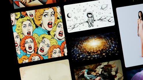
If you’ve been online much recently, chances are you’ve seen some of the fantastical imagery created by text-to-image generators such as Midjourney and DALL-E 2. This includes everything from the naturalistic[1] (think a soccer player’s headshot) to the surreal[2] (think a dog in space).
Creating images using AI generators has never been simpler. At the same time, however, these outputs can reproduce biases and deepen inequalities, as our latest research[3] shows.
How do AI image generators work?
AI-based image generators use machine-learning models that take a text input and produce one or more images matching the description. Training these models requires massive datasets with millions of images.
Although Midjourney is opaque about the exact way its algorithms work, most AI image generators use a process called diffusion. Diffusion models work by adding random “noise” to training data, and then learning to recover the data by removing this noise. The model repeats this process until it has an image that matches the prompt.
This is different to the large language models that underpin other AI tools such as ChatGPT. Large language models are trained on unlabelled text data, which they analyse to learn language patterns and produce human-like responses to prompts.
Read more: AI to Z: all the terms you need to know to keep up in the AI hype age[4]
How does bias happen?
In generative AI, the input influences the output. If a user specifies they only want to include people of a certain skin tone or gender in their image, the model will take this into account.
Beyond this, however, the model will also have a default tendency to return certain kinds of outputs. This is usually the result of how the underlying algorithm is designed, or a lack of diversity in the training data.
Our study explored how Midjourney visualises seemingly generic terms in the context of specialised media professions (such as “news analyst”, “news commentator” and “fact-checker”) and non-specialised ones (such as “journalist”, “reporter”, “correspondent” and “the press”).
We started analysing the results in August last year. Six months later, to see if anything had changed over time, we generated additional sets of images for the same prompts.
In total we analysed more than 100 AI-generated images over this period. The results were largely consistent over time. Here are seven biases that showed up in our results.
1 and 2. Ageism and sexism
For non-specialised job titles, Midjourney returned images of only younger men and women. For specialised roles, both younger and older people were shown – but the older people were always men.
These results implicitly reinforce a number of biases, including the assumption that older people do not (or cannot) work in non-specialised roles, that only older men are suited for specialised work, and that less specialised work is a woman’s domain.
There were also notable differences in how men and women were presented. For example, women were younger and wrinkle-free, while men were “allowed” to have wrinkles.
The AI also appeared to present gender as a binary, rather than show examples of more fluid gender expression.
3. Racial bias
All the images returned for terms such as “journalist”, “reporter” or “correspondent” exclusively featured light-skinned people. This trend of assuming whiteness by default is evidence of racial hegemony built into the system.
This may reflect a lack of diversity and representation in the underlying training data – a factor that is in turn influenced by the general lack of workplace diversity[5] in the AI industry.
4 and 5. Classism and conservatism
All the figures in the images were also “conservative” in their appearance. For instance, none had tattoos, piercings, unconventional hairstyles, or any other attribute that could distinguish them from conservative mainstream depictions.
Many also wore formal clothing such as buttoned shirts and neckties, which are markers of class expectation. Although this attire might be expected for certain roles, such as TV presenters, it’s not necessarily a true reflection of how general reporters or journalists dress.
6. Urbanism
Without specifying any location or geographic context, the AI placed all the figures in urban environments with towering skyscrapers and other large city buildings. This is despite only slightly more than half[6] the world’s population living in cities.
This kind of bias has implications for how we see ourselves, and our degree of connection with other parts of society.
7. Anachronism
Digital technology was underrepresented in the sample. Instead, technologies from a distinctly different era – including typewriters, printing presses and oversized vintage cameras – filled the samples.
Since many professionals look similar these days, the AI seemed to be drawing on more distinct technologies (including historical ones) to make its representations of the roles more explicit.
The next time you see AI-generated imagery, ask yourself how representative it is of the broader population and who stands to benefit from the representations within.
Likewise, if you’re generating images yourself, consider potential biases when crafting your prompts. Otherwise you might unintentionally reinforce the same harmful stereotypes society has spent decades trying to unlearn.
References
- ^ naturalistic (twitter.com)
- ^ surreal (twitter.com)
- ^ latest research (urldefense.com)
- ^ AI to Z: all the terms you need to know to keep up in the AI hype age (theconversation.com)
- ^ workplace diversity (www.vox.com)
- ^ more than half (www.worldbank.org)


